One Big Idea: How Good is Your Logo?
In this week’s episode, we talk all about logos with Finch Brands’ Creative Director, Jess Koffman. We review what makes a logo successful and detail the finer points of great logo design. If you like our podcast, please subscribe and leave us a rating!
Podcast: Download Subscribe: iTunes | RSS
Transcription:
Bill Gullan: Greetings one and all, this is Real-World Branding, I’m Bill Gullan, President of Finch Brands, a premier boutique branding agency. This is One Big Idea, and today we have ‘logopalooza’ or something similar. We’re going to talk a lot about logos, and we’re going to introduce to the discussion here and to all of you through your earbuds, Jess Koffman, who’s the Creative Director at Finch Brands and is a logo creator and evaluator extraordinaire.
So we’re going to have Jess weigh in a little bit on some recent research about the best logos, as well as thoughts from her own career in terms of what makes a great logo and how we think through how to create great logos and visual identities for clients.
Before we get to Jess, just to set this up, there was a survey by the Morning Consult, the research firm and AdAge were responsible for this in partnership, and they surveyed for favorite logos. They surveyed Americans, I haven’t read the whole methodology, but just general consumers and then also a group that they consider to be ‘brand experts,’ an those are marketers and designers and everything else. They presented their results of the top logos from a perspective of both these audiences, and there were some areas of agreement and some areas of difference, and I’m not sure what the actual criteria were, but we thought that this was the makings of an interesting conversation about the technical and emotional aspects of creating great logos.
Without further ado, Jess Koffman, Creative Director for Finch Brands is here, thanks for coming and joining us.
Jess Koffman: Thanks for having me.
Bill: So Jess, full disclosure, you have developed at least one logo on this list-
Jess: At least one.
Bill: … on the surveys, at least one.
Jess: It’s not number 31, but it should be.
Bill: Yes, that’s a hint. We’ll give it away at the end of the podcast for those still listening, which I know will be everybody. A little bit before we get into it about your own back story, which is really interesting. Could you take us through that career journey up to this point and then we’ll dive into logos?
Jess: Absolutely. I like to think of it as my hunt, my personal hunt for the cruelest winter ever, because I started my career in Chicago, where I worked for a promotional agency on accounts like Coca-Cola in the beginning, and then quickly shifted over to a branding think tank. It was a teeny tiny agency with really big clients. I got to work on some brands like Build-A-Bear Workshop, I did their flagship store, we built the brand Five Below from the ground up, and are happy to see them succeeding locally and beyond, and just everyone from more Coca-Cola work to Microsoft to everyone in between – lots of fun work with that company.
Then Chicago I guess didn’t seem to be cold enough, so I then migrated to Minneapolis where I went in house and worked for Target. Worked with them doing product design and marketing. I designed one of their gift cards, and got to see what makes that brand tick, which is quite an operation. And I got to eat at the Target café.
Bill: Nice.
Jess: Then, I decided it was time to come back home to tropical Philadelphia. This is where I’m from originally, and-
Bill: Particularly balmy today-
Jess: Yeah, yeah.
Bill: … here in November, yeah.
Jess: Definitely. And found my creative home with Finch Brands, and was initially working on freelance projects with Finch Brands and partnering up on the hard ones and now I get to do the hard ones all the time here. Love it.
Bill: Thank you, and we’re so glad to have Jess every single day and though she is modest, the logo in this list that was actually a big favorite of consumers in the survey is the Baskin-Robbins logo, which embeds the number 31 for flavors in the heart of the mark. Anything you wanted to say about that logo or other logo design projects that you’ve worked on that were particularly fun?
![]()
Jess: Sure. That one was funny because when they launched it, they actually felt the need to put it on the homepage and say, ‘Do you see the 31?’ And I’m like, ‘Stop, you’re ruining all the magic!’
Bill: That’s funny.
Jess: FedEx doesn’t usually say, ‘Do you see the arrow?’
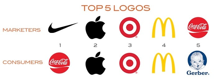
Bill: Hey look, there’s an arrow in our logo. That’s funny. When we look at the top 10 in this survey, the top four or five, consumers and marketers seem to agree on, if not exactly on the order. Both marketers top five were Nike, Apple, Target, McDonald’s, and Coca-Cola. Top five for consumers were Coca-Cola, Apple, Target, McDonald’s, and then Gerber. Nike was down to eighth among consumers.
Then when you go all the way down to the very bottom, there was a whole lot of diversity among what we would call the losers. The bottom five I think for marketers was Anthem and then United Healthcare, maybe a categorical consistency here, and then WeWork, Western Union, and Humana – health insurance taking a beating here.
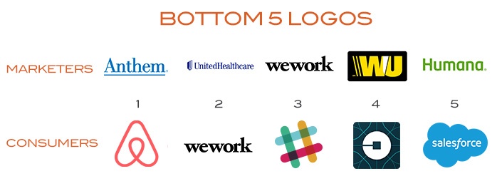
Then for consumers, the bottom, Airbnb, which quote unquote, ‘had a sexual look’ to consumers, ‘Tells you nothing,’ one consumer said. WeWork was actually in the bottom for consumers too, it’s just a typeface of the mark, lowercase, so it almost looks like it’s one word, ‘wework’ or whatever.
Jess: A non-sexual look.
Bill: Yeah, non-sexual look though, they had that going for it. Slack was down there, Uber was down there, salesforce… So winners and losers, it’s an interesting study and you know, marketers are saying probably what our favorite logos are, probably looking through the lens of what these brands have become and how strong they are.
We thought it would be interesting to hear Jess’s perspective. When we look at some of the logos, either in the survey or elsewhere, what are some of the best logos from your perspective across the whole landscape and what makes them so great?
Jess: There’s a lot of great lessons with these logos because clearly there are ones that rose to the top. Even at the top of the marketer’s list and number eight in the consumers, which is still pretty up there, the Nike swoosh. The coolest thing about that, and it comes up a lot with logo projects with clients, it’s just that it takes time to become an icon. They officially dropped ‘Nike’ from their logo in I think 1995, and it’s been quite some time, but the swoosh is officially their mark.
But the behind the scenes design story of that is that this particular logo was always kind of a thorn in a designer’s side because the story originally was that Phil Knight starting his company and he is like a freelance professor at this random university and he’s doing this product. He grabs a student and says, ‘Hey, I gotta do logos, my investors are coming over from Japan, can you do it, can you do it, can you do it overnight, just do it.’ And so basically, she did it, and he picked one and paid her $35 bucks, which netted out to like two bucks an hour for her-
Bill: Not bad, right.
Jess: … and so then you know, it goes on to become one of the most recognized icons of all time in the world.
Bill: They made it right with her, didn’t they? After a while, but-
Jess: They did, it was a little bit like, ‘Ah, it’s always going to happen,’ but they did actually 10 or so years later give her a gold swoosh ring and took her out to lunch and gave her some stock options too, so she’s pretty set now.
Bill: I think she may have appreciated that more than the lunch at Fuddruckers or wherever the heck they went that day-
Jess: Yeah, right.
Bill: … but she certainly deserves it. What is it about the Nike logo other than the business that was built around it and all that it’s come to mean, from kind of a technical or a meaning perspective, what is it that appeals to you, Jess?
Jess: It’s a very nice stylization, it symbolizes the wing of the Greek goddess of victory-
Bill: Which is Nike herself, right?
Jess: Which is Nike, and so it takes that story and in one clean mark, it tells that and still, even if you don’t know the history behind it, it suggests momentum, it suggests energy, and just the … I mean you can’t separate it from the marketing juggernaut behind it, so it’s motivating for people. It is ‘just do it,’ it is sports, and just a glance at it really fills you with all that association.
Bill: Perfect. To your point, the logo was developed in 1971, and they didn’t take the Nike name off of it for really 25 years, so the business by that time was a multi-billion-dollar global juggernaut, so I guess one can’t force icon status too early, but yeah, incredible, both story and brand that’s been built. Other ones that particularly stand out to you?
![]()
Jess: Yeah, I think it’s interesting the number one on the consumer side is Coca-Cola, and this stood out to me because there’s a jpeg that’s been floating around on Pinterest and around the web, and it takes I think it compares the evolution of the Pepsi logo and the Coca-Cola logo, and I think it takes it all the way back to like 1896 or whenever. It shows how Pepsi has followed so many design trends, like they had a cap in the logo then they reduced the cap to the swirls on the cap then they did you know, they’ve got some amorphous swirling thing going on right now. But Coca-Cola pretty much has reserved the original type and the original script and is so iconic.
Now, if you really read into that, that jpeg that has been floating around is a little doctored up and forgets a couple of phases that Coke had, but the point is that when you have equity like that and such a long history, you have to respect that. You’re able to build your brand with the elements that you surround it with and the stories you tell beyond that. They have really stayed true to it and there is a reason why in the South, they ask for a Coke when they want a soda. Their branding is strong.
Bill: Sure, they definitely do and it definitely is, so that’s another one. Another one that obviously is a company that has a tremendous amount of financial and cultural value at this point, hadn’t always, but is Apple. What is it about the Apple logo? Obviously interesting backstory there, but what about it that draws your eye and gets you fired up?
Jess: Other than the fact that they have me, you know, handcuffed to their machines and their smartphones-
Bill: Pretty much, same here.
Jess: … it is a beautiful mark and it has a cool story in the background, and that’s there was a third, lesser known founder of Apple who actually designed their very first logo, which was this crazy illustration, this very vintage storybook detailed illustration of Sir Isaac Newton sitting under the tree, waiting for that apple to drop on his head, and thus discover gravity. It had a banner running through it that had quotes from Walt Whitman or something like that and basically there’s no way that was a logo, it was really an illustration.
![]()
Bill: It’s not easy to embroider that on a golf shirt for example.
Jess: Yeah, that would be quite the embroidery. But anyway, that was for Apple 1, with Apple 2, Steve Jobs got involved, the lesser known founder sold his stake for 800 dollars, it would have been worth 22 billion today.
Bill: That’s a shame.
Jess: But anyway, Steve Jobs recognized that this complicated illustration was not going to reproduce well on product, so he tasked his logo ad friends to design something that could carry the story forward and be iconic. So Rob Janoff was the guy he turned to in 1977 and just didn’t give him much of a creative brief, but said, ‘Don’t make it cute.’ Typical Steve Jobs.
Bill: Right right.
Jess: There’s two features of it which are kind of interesting. The fact that it was known for so long to have rainbow stripes running through it and that was sort of a nod to the fact that when they came out with Apple 2, it had color capabilities in the monitor, and that was a big deal at the time, so that was their way of capturing it, and of course Steve Jobs had to stipulate exactly which colors in exactly which order.
Bill: No doubt.
Jess: Apparently, he had a knack for that.
Bill: It just didn’t appear, yeah.
Jess: And then there’s all sorts of design lore out there about why there’s a bite out of the apple and it’s everything from the fact that it’s kind of this coder wink to the fact that byte, like byte is a computer thing and it was a little signature of that, but also that it’s a bite from the tree of knowledge, like Eve taking a bite from the tree of wisdom or what have you.
Then the designer actually who’s been interviewed about it said he simply added a bite so that it didn’t look like a tomato, and when you take a bite out of an apple it’s crisp, and the bite stays intact, and it’s also a way for him to show size and scale, so that it certainly reads as an apple. It certainly does now. It’s morphed a little bit since then, the colors came out, which upset a lot of Apple users, but they did it when they came out with all the different colors of iMacs, and so each one had a matching apple on it, and it became monochromatic.
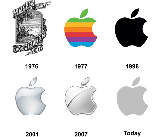
I guess the fun lesson from this one is really sometimes logos need to evolve, and you’ve got to do it to stay current, and if you have a good reason to evolve, like on product, and your product’s changing and your product has new capabilities, and so forth, then that’s a good time to do it.
Bill: Perfect. Another one, and this is a brand that I know that you worked on earlier in your career is McDonald’s. What’s your take on the arches? I know it performed well, it was number four on both consumer and marketer parts of the survey. What is it about the golden arches that really works? And again, many of these are combinations as you’re telling us of technical aspects, but also history and heritage. So tell us about the arches.
Jess: The arches actually came from an architectural element that were around in the 50s. So the architects had built a giant golden arch in front of the restaurant and in the back of the restaurants, and so for visibility basically. So you could see it from the roadside and say, ‘Oh my God, I need a burger.’ When they had to distill that into a logo, they took a cue from the most notable feature of the geographic location and synthesized it into the arches.
It originally had a little bit of a roof slant to it also going through the golden arches, but that evolved out, probably a good thing. It is the arches that we love today, and like you said, I did have a chance to work with the arches, I had a chance to do a project with McDonald’s where we were building play places that were kids’ gyms to teach them about fitness and how you’ve got to work out a lot to burn off those supersize fries.
Bill: You can say that again.
Jess: It was a big education, but it was fun to work on it, and basically the internal, there’s a lesson in this one too, I guess is that we were putting this gym in and they tasked us with naming it, developing the signage, the graphics for it, the logo, and so we were really excited to come to the table in the first presentation with our recommended name, which was the ‘Clown Around Gym.’ And so there was kind of an awkward dead silence in the room after we said that name, and there is a woman at McDonald’s headquarters whose full-time job is to manage the personality of Ronald McDonald, and she looked at us and said, ‘Oh no, that’ll never work, Ronald McDonald is not a clown, he’s an ambassador of fitness and fun.’
Bill: There we go.
Jess: Then she went on to show us all kinds of pictures of Ronald McDonald skateboarding and surfboarding and snowboarding and-
Bill: Just being creepy, yeah.
Jess: … it wasn’t creepy at all that he had clown makeup and clown shoes, you know? And we actually wound up not using his face on any of the materials that we developed, and just simply did little cropped motions of him wearing a sneaker or whatever-
Bill: Oh wow.
Jess: … and so it wound up being called R Gym, R for Ronald.
Bill: Interesting, interesting. So looking at the list, and again, there’s not a ton of detail, just the rankings, any surprises there from your perspective? We obviously hear clients will come to us and say, ‘We want our swoosh and we want this and that.’
Jess: Yeah.
Bill: Anything surprise you based on what we read?
Jess: I mean most of the ones on there are obviously well-celebrated and for good reasons. I’m surprised Amazon isn’t in there since they have taken over the world now. One of my favorite firms overseas Turner Duckworth, they actually did the evolution and built the smile into their logo, but apparently that was not top of mind or prime for most of the people in this survey.
![]() I was also surprised that the Olympic rings weren’t on there because that five-ring circus is always interesting, and when people add it to their products, they literally sell more. They’ve done studies on that, you know, so I guess consumers went for more of the nostalgia touch, like the Gerber baby and so forth, and that’s not surprising. If we had a logo with a puppy in it, that might be in there too, but I mean it’s part of Americana and they still have the Gerber baby contest and so forth. It’s cute, I see why it’s on there.
I was also surprised that the Olympic rings weren’t on there because that five-ring circus is always interesting, and when people add it to their products, they literally sell more. They’ve done studies on that, you know, so I guess consumers went for more of the nostalgia touch, like the Gerber baby and so forth, and that’s not surprising. If we had a logo with a puppy in it, that might be in there too, but I mean it’s part of Americana and they still have the Gerber baby contest and so forth. It’s cute, I see why it’s on there.
Bill: Right, no doubt, no doubt. When we use the word brand, oftentimes people may think immediately of a logo or a visual identity, but I think we all know that brand has much more to it than that. Although identity is an important market face and artifact of what brand is and stands for. In that spirit, what role does a logo play in expressing the personality of a brand?
Jess: When I think about brand personality, and this is a logo’s job too, is that, and design’s job in general, is that it’s not just decoration, it’s absolute communication. So that’s why it’s so important for us as designers to really get to know the client, get to know their brand personality, to really dig deep on that.
We do a lot of work with our clients when we first get to know them, we take a look at their brand, see what’s working, see what’s not. Look at the competitors in their space, and critique them as well and see what lessons there are, and really figure out what their personality is. Sometimes we ask if they were a celebrity, who would they be. You would be surprised how many people want to be George Clooney, it’s amazing.
But there is quite a range, and we need to know that so we can filter through as we’re designing – what is this character, how do we portray that, how do they become the approachable person in their industry, and does that mean lower case type, or does that mean that we use really bright, positive color palette involved in it?
It’s not just arbitrary decisions like ‘ah, yeah, my favorite color is magenta so I figured I’d use that. My favorite font is this.’ That’s everything you should not be doing when determining a brand personality and a logo personality.
Bill: Before we go, you’ve highlighted a couple of really great aspects of many of these logos and I think that in and of itself gives a window into how great logos are made and what they mean and everything else. But before we sign off, when you think about designing and assessing logos, what is it, are there a couple of important rules from your perspective that sort of put in practice by our creative team, or ought to be that sort of govern what makes a good logo or a great logo?
Jess: Yeah, absolutely. Some of the basics are pretty simple, but it’s surprising how many logos can squeak through that don’t quite get them right. One of the prime things to think about is that a logo reproduces well at a small scale, and it also has visibility. So when you think of a logo appearing on signage, appearing like McDonald’s did, from the roadside, driving by, and these are all areas of design we consider when we work on a logo.
You can’t do the skinny little tasty fonts for a brand that’s going to have big impact. If you can’t see it from across the conference room, you’re not going to see it from across the parking lot, so you have to avoid that kind of thing.
Then, to get to that level of being an iconic logo and being timeless, it can’t be inflexible. It has to have legs, it has to have the ability to go on and tell stories and be part of a bigger context, and sometimes that means there’s multiple versions of it, it’s modular, it turns into things, but with some parameters so there’s equity in what you’re doing.
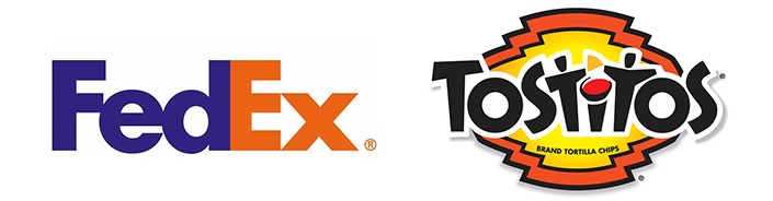
Another thing I’d say is that a logo absolutely has to be expressive and own-able. If you can hide a secret meaning or a message in it, it’s awesome, like FedEx, there’s two people dipping chips inside the Tostitos logo, that little 31 thing.
But I think a big lesson too is just that kind of in the example in the Pepsi logo, the blindly following design trends can be a big downfall, so one of the most obvious examples of this in modern times I’d say is the whole lower-case trend.
So many companies are doing it, it’s like hey, this is not AT&T all caps talking to you, this is friendly at&t lower case talking to you, and we’re going to just go ahead and collect that giant bill from you month to month, thank you. And so a lot of brands do this, everyone from Amazon, Aramark, Ebay, all these people went from having traditional sentence case logos or upper case logos, and went to full lower case in the first letter. Macy’s, Xerox, even Facebook.
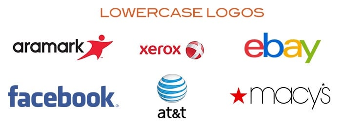
So they all switched from first letter capitalization to lower case, and that was right for them, it gives them that conversational feel, and it works in some arenas. But then there’s others who are just traditionalists, they still adhere to the rules of grammar. Who would have thunk it, you know? Lipton, Coca-Cola, Google, and then there’s a reason to be all caps in some markets too, like Ikea, Target, they’re big, bold presences in their space, so Best Buy.
I guess the point for me really is you don’t just go lower case because everybody in your industry’s doing it. You have to find a way for your own logo, your own story to stand out, and you have to be able to own it, so it may be a trend, but it doesn’t mean it’s right for you.
Bill: When you were talking about Pepsi and Coke, one of the points that you were making was that Pepsi seemingly has nipped and tucked and tweaked their logo in response to more or less every design trend over time, where as Coke has maintained sort of a remarkable consistency in the execution of their logo. Is there a time and if so, when, when logos really should seek to modernize themselves?
Jess: You know when it’s time to evolve when you just need to breathe energy into it again. You need to breathe some new life. You’re not reaching the audiences that you want to. There’s a lot of brands now that are doing kind of retro things, like gum is doing, ‘Let’s take a look at retro Pepsi, let’s take a look at retro Juicy Fruit and all this stuff.’ They’re messing around a lot. I think you can get to the point where you’re messing around too much, you don’t want to change it like Pepsi.
I’d say in the past, I think a logo, timelessness for any given logo is probably actually more like a decade, and I think recently it’s probably more like five years, but that’s not a hard and fast rule, it really depends on your brand and you want to make sure that you’re constantly making an impression.
If you have new product offerings, you might want to come out with a splash, you might want to add rainbow stripes into your logo, you might want to do all sorts of things. But I think it’s a good exercise and it’s a good exploration to have. You really need to keep the lens on your own personality and be aware of how that can work for you or work against you. It’s a chance to really connect, and you can’t miss out.
Bill: So this may be an unfair question, and I might be asking a parent to pick their favorite child when they have multiple children, but are you able to say what your favorite logo of all time is?
Jess: That’s a ridiculous question, because I can’t pick one, I have to pick three. And this one, I actually have a little personal relationship to in a way, the I Heart NY logo, by Milton Glaser. I did not design that in any way, shape, or form, that’s not my connection, but what I love about that logo is that it changed language.
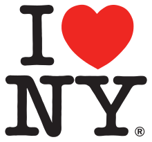
The logo design itself changed the way we speak because before that logo, people didn’t really refer to I ‘heart’ things. It was developed for a New York commerce organization, it was for tourism basically and he, Milton Glaser’s riding through a taxi cab just thinking about his city and basically how iconic it is and then designs this wonderful iconic logo with this shorthand of heart.
I kind of did a little borrowing from it when I had my sights set on Target and sent them a thank you card that was I ‘Target’ MN, so thanks Milton, it worked, and I heart him.
Another one that I would say is a favorite is FedEx. When Landor designed the FedEx logo in 1974, it had previously been the full name, Federal Express, and Landor did I think nine months of brand study, you know, just talking to consumers about what they were saying about FedEx. And that’s exactly what they were saying, they were saying ‘FedEx,’ they abbreviated it.
So Landor felt like it was necessary to go with that, to listen to their consumers and really talk about it not unlike KFC or BP or whatever else. In the course of that research and abbreviating it, they discovered that obviously the lower-case E fit with the X in such a way where they could build that forward arrow into the negative space of the mark, and it’s such a perfect symbol for what they do, it’s motion, it’s direct delivery, it’s just perfect and just a testament to the power of negative space, of white space.
So often clients’ tendency is to fill all the white space up, but the white space can be really important, and this logo really demonstrates that.
Then my third one I’d say is not on this list and not on many lists, but it should be. The NBC peacock. It’s brilliant. It’s a perfect visual metaphor from nature. It’s a display of color, and they actually launched the peacock logo in 1956, when NBC did start broadcasting in color and at that point it was this funky looking 11-feathered peacock, and it doesn’t look anything like the one of today, but it was a perfect metaphor.
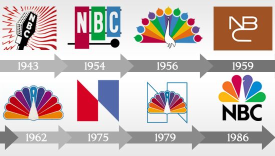
The way it evolved over time is very clean now and this one even had a little bit of a controversy with it. When NBC merged with Comcast, they first wanted to just call it NBC Universal and get rid of that peacock. Apparently this upset everyone at NBC all the way up to Brian Williams, and they had an internal meeting and launched the NBC Universal logo, but they secretly added the peacock back in because you can’t get rid of that peacock.
I love that one, and it was cool because I looked around for some history on it just out of curiosity and they had this 60th anniversary special when it launched, I mean it was in ‘86 I think and it is so dated, and it has everyone from Johnny Carson to Rudy Huxtable sitting around this huge peacock on center stage, and they’re singing this tribute song to NBC’s 60th anniversary and it’s like, ‘Did you know, did you know, NBC.’
It’s really cheesy, but I thought it was a fun launch, and it made me think about probably one of the most formative moments in my logo design career, which was maybe like a year, year and a half into my career, I finally got a logo chosen, and I got to do a logo for this group called TAP Pharmaceuticals, and this was in Chicago, and they did, I mean it was like an internal group for a pharmaceutical company, but they wanted to throw a party for the launch.
This is my first experience of this and they go to the party and they literally hired a chainsaw artist to carve my logo out of a block of ice, and I was like, ‘I made it! This is amazing! This is going to happen every time!’ But unfortunately, although some logo launches that I have been part of did include things like stilts and lots of cheese platters and custom cupcakes and things like that, no more ice carving, but I am totally up for it in case anyone out there wants to come out with a bang.
Bill: Well, I’ll definitely bring my chainsaw next time to the party. We joke, we know that we at Finch have done T-shirts and obvious things like that as well as more fun and less obvious things like cupcakes, other ways to celebrate the launch or release of a new logo or an evolved logo. We always talk about how the brand needs to communicate externally, but how it also needs to be felt and lived internally, and often the moment of the development of a new logo or the sort of evolution or tweaking of a logo, a cosmetic refresh, is a great time to bring everyone aboard. So ice sculptures, chainsaws, whatever it takes.
Jess, thank you for your time and for your insight. We will sign off from the Cradle of Liberty.