What is data design? And how does it help you transform raw data into refined insights that are more digestible, actionable, and shareable?
Think of the favorite dish you enjoy eating. Let’s say it’s the Italian dish, Seafood Fra Diavolo.
The dish is a delightful conglomeration of fresh scallops, crab meat, clams, mussels, lobster and shrimp in a light, spicy tomato sauce served with pasta. No matter your favorite dish, you have to admit that it doesn’t just show up ready to be devoured. The ingredients need to be diligently sourced, carefully prepared and presented in a pleasing way that delivers the optimum experience.
The same is true of your data.
These days, companies have voracious appetites for data. Companies set themselves up with veritable all-you-can-eat buffets of data output from the research projects they sponsor. Rightly so, capturing data points and turning them into high-value insights is an effective blueprint for many decision-makers. Here’s the rub. Only a small percentage of the data is being used to make decisions that drive customer experience. Part of the challenge is that teams and leadership have difficulty socializing the insights in meaningful ways across multi-functional teams.
Brindy Gibbs, Insights Design Manager and Devon Moyer, AVP, Design at Finch Brands recently presented a program during Finch Brands’ “Live the Brand” event. The presentation focused on ways to socialize insights and use the design practice to make data more visual, digestible, and shareable to people who aren’t experts in data management. The presentation focused on the fact that insights are only valuable when they are translated into ways that can be acted upon and used to inform decisions. Brindy and Devon walked through Finch’s recent work for clients such as Comcast Xfinity, Sodexo, J&J and Nutrisystem and demonstrated how companies of all sizes can use data design, visualization, videos, and motion graphics to animate insights and bring them to life in the world. One of the biggest issues they pointed to was the challenge of knowing what to do with data once you’ve captured it.
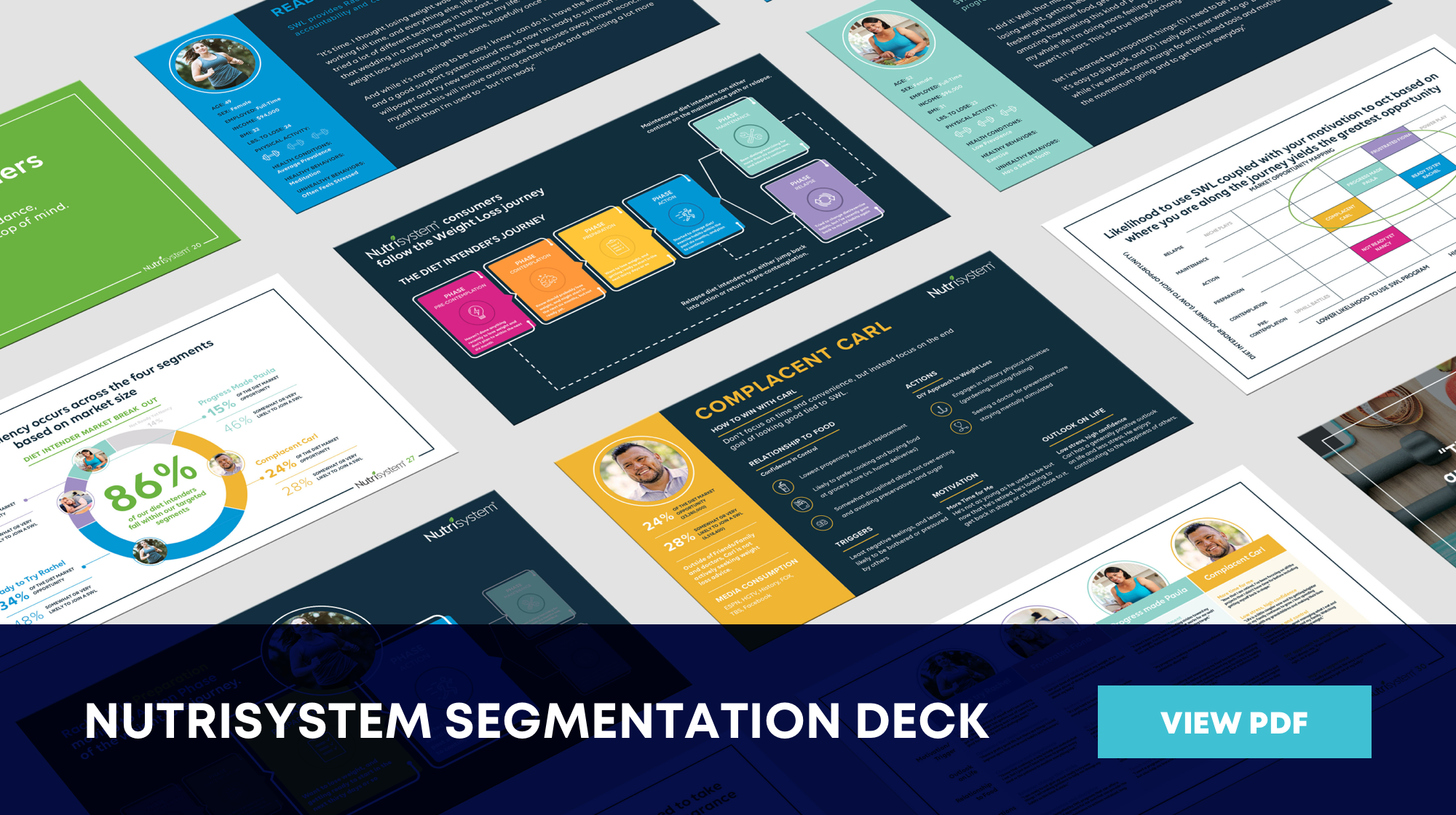
Recent examples of bringing data design to life include NutriSystem, a weight loss food delivery program and Sodexo, a facilities manager that provides food services. You can check those out below:
Generating large amounts of data creates obstacles for an organization.
Performing a deep dive into a particular challenge is an effective way to generate an abundance of data points that can provide the illumination you need to solve wicked challenges. There are inherent obstacles that need to be managed to prevent the data from dying on the vine:
INFORMATION OVERLOAD
There is too much information to process and not all of it is relevant to the audience. In other words, there’s a lot of data that probably won’t be helpful but it’s hard to know until you dig into the data.
INEFFECTIVE COMMUNICATION
The larger the organization, the more challenging it is to achieve synergy across teams. Research findings often get lost in translation between teams because they don’t communicate in ways that advance the data in a larger way.
LACK OF EMPLOYEE ENGAGEMENT
Team members often ignore static media which means the key insights go unnoticed and nothing changes. We are all bombarded by information each day, especially internally, so boring or pointless communications don’t stand a chance of capturing their attention.
Data is only as powerful as the insights derived from it. Insights are only actionable if they are used to inform decisions.
Why Data Design?
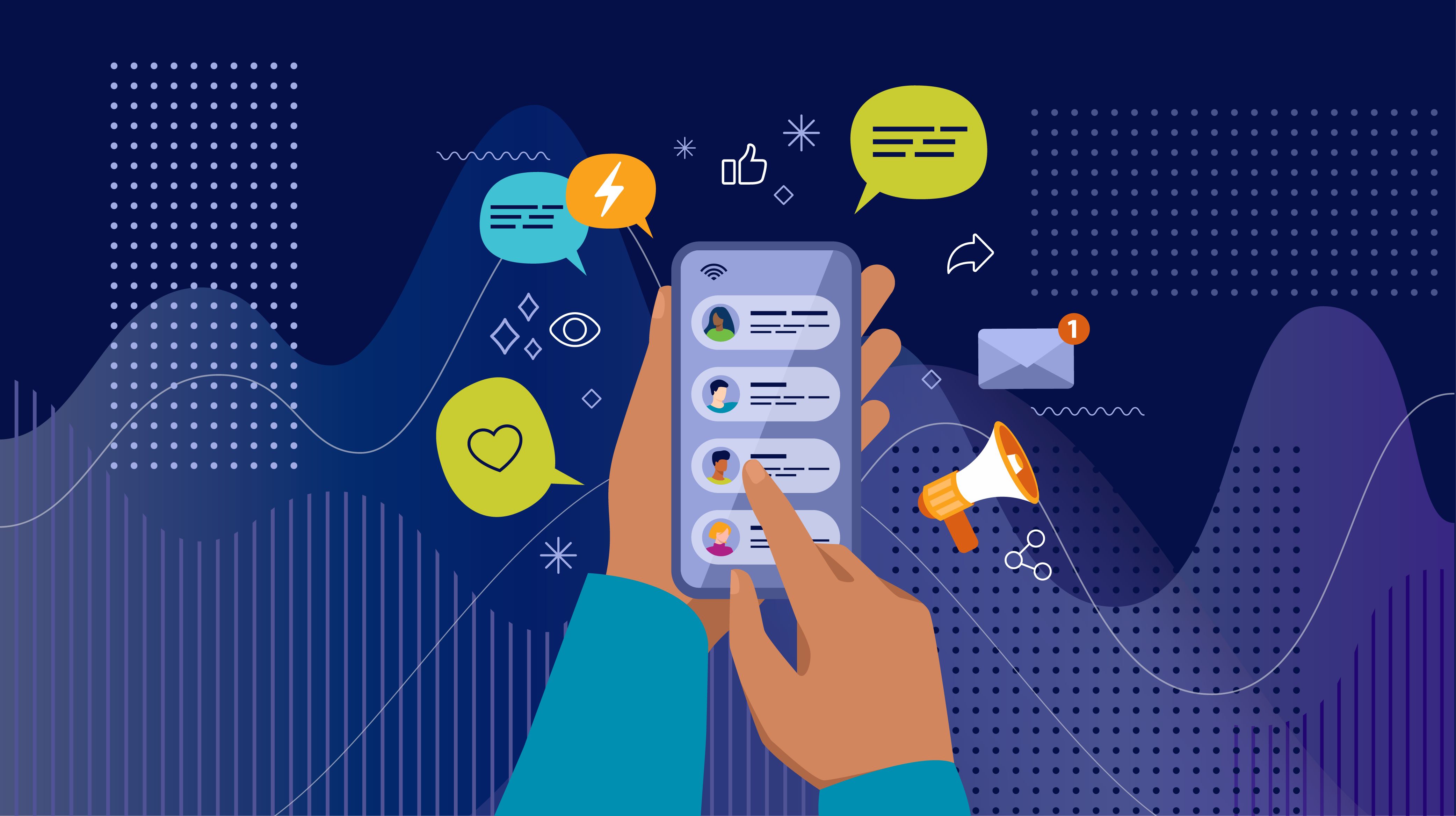
Data design is a method of visualizing data in ways that become tangible for audiences and helps people emotionally engage with content. Clinical studies have revealed that more than 75% of all information processed in the brain is visual. There are several reasons why data design is a smart alternative to communicating with words-only:
PEOPLE HAVE SHORT ATTENTION SPANS
We need to communicate a lot of information in the most impactful and efficient way they will understand.
DATA IS NOT A UNIVERSAL LANGUAGE
Because of its complex nature, data can be intimidating and complicated to understand by non-experts.
STORIES ARE MORE MEMORABLE
Storytelling engages multiple areas of the brain, including areas directly responsible for long-term memory. The most memorable provide a place in the story where viewers recognize themselves as active participants and not simply passive observers.
IT TURNS INSIGHTS INTO ACTION
Compelling stories create an emotional connection with audiences that compels them to act.
STATIC METHODS FAIL TO INSPIRE PEOPLE
We live in an incredibly visual world that engages and enthralls us with a few simple clicks on our phones or tablets. Movement and motion send signals to viewers that invite them in to the discussion.
Data design looks good and makes clients look good, too.
Sourcing your data,
preparing your data, and
presenting your data in visually pleasing ways could be described as the holy grail of socializing insights within an organization. Doing so doesn’t just make your insights more digestible, actionable, and shareable, it makes clients look really good too. Here’s how:
-
By equipping them to be the expert on the subject
-
By communicating the value of Insights-driven work
-
By saving time, especially among team members who just want to “get to the point”
-
By uniting cross-functioning teams and creating an opportunity to exchange knowledge and skills they otherwise would not have known existed
-
By sparking conversations that enact real change
It takes a village to transform static data into dynamic insights that people will talk about. Here’s how.
1. LAY THE FOUNDATION
-
Understand the client’s needs and goals
-
Determine the scope of work
-
Establish a research approach
2. TRANSFORM THE DATA
-
Review the data
-
Use strategy to “storify” the data
-
Create an Executive Summary Deck
3. GET ORGANIZED
-
Batch data points
-
Identify key themes
-
Create a data map
4. CRAFT THE STORY
-
Make the data approachable
-
Incorporate a strong CTA or closing questions to spark conversation
5. BRAND IT
-
Brainstorm visual concepts
-
Create storyboards or initial graphics
6. BRING IT TO LIFE
-
For videos, produce and animate motion graphics
-
For data and deck designs, optimize PPT, Keynote, or Google slides
How do you condense a 100+ slide report into information that teams can understand and start having conversations about? Creatively, that’s how.
Our insights socialization toolbox contains a range of effective tools, including multi-purpose videos, powerful motion graphics, curated infographics, as well as tools for journey mapping and customer personas. They are designed to help clients present research findings and insights in ways that are visually compelling and understandable to cross-functional audiences who are expected to turn insights into profitable outcomes. Finch Brands helps global, national, and local clients use proven design and visualization methods to help them go from static data to dynamic insights that satisfy the expectations of every stakeholder at the table.